PORTFOLIO: THE INTERNATIONAL PARLIAMENTARY NETWORK FOR EDUCATION | REBRAND
Creating ownable visual territory in a crowded political landscape

The challenge
After five years, IPNEd's visual identity had become tired and limiting. When non-designers created materials, the brand suffered from inconsistent execution. The existing red-orange palette felt politically charged and too urgent – a problem for an international network engaging parliamentarians across diverse political spectrums while maintaining neutrality.
IPNEd needed visual distinction in a crowded field of parliamentary networks. The challenge was evolving beyond generic institutional aesthetics to establish an ownable visual language that works across cultures, political contexts, and media formats.
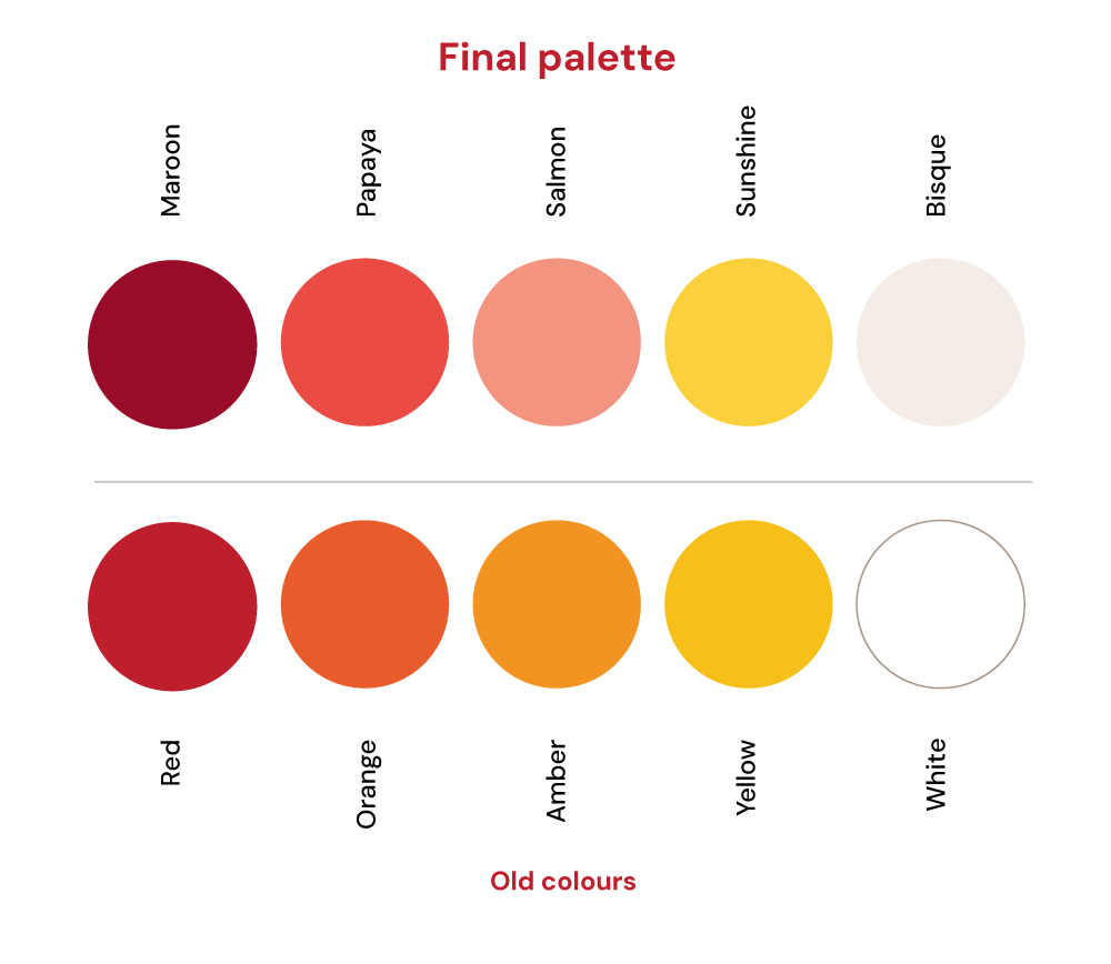
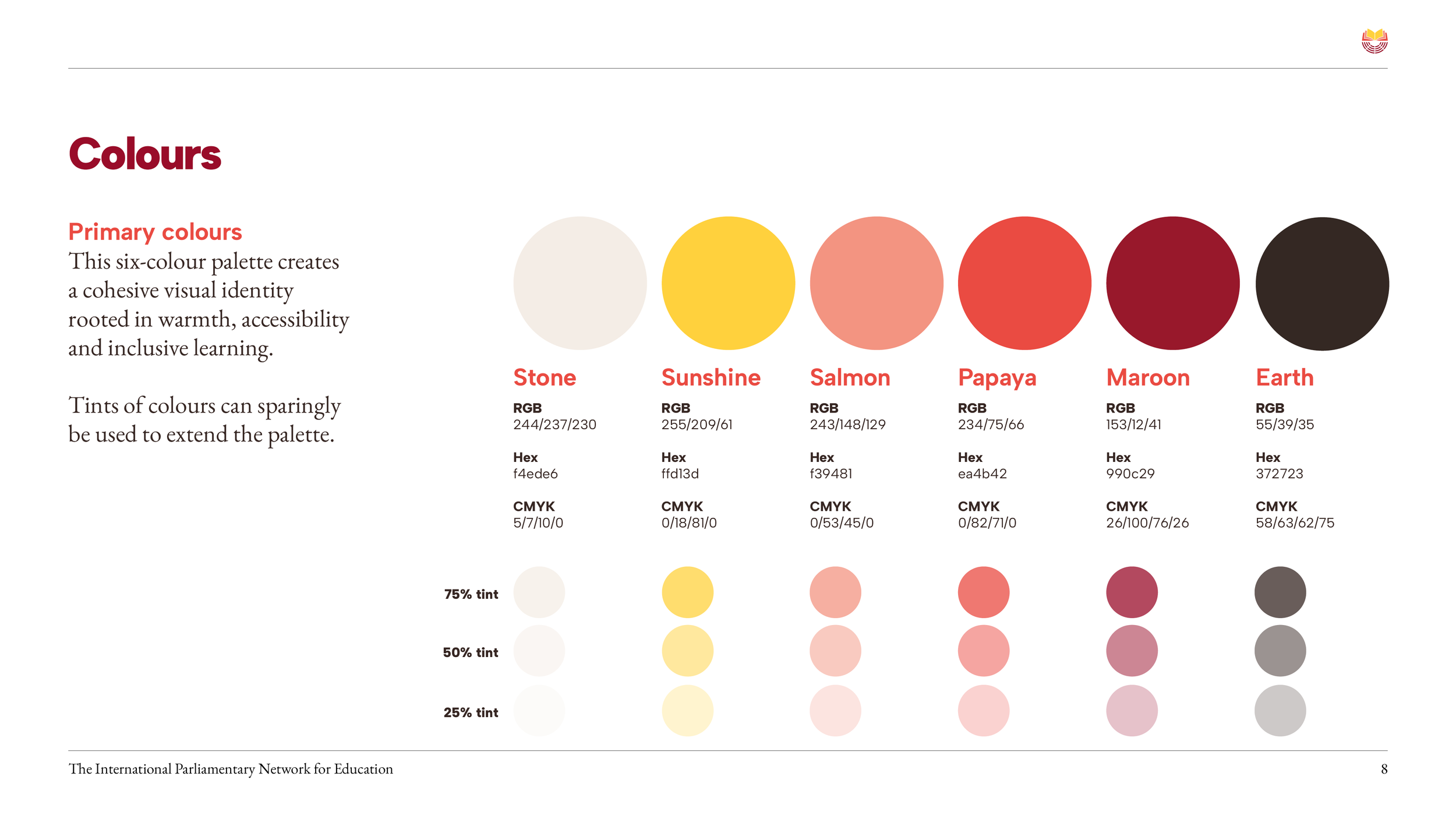
We subtly shifted IPNEd's palette from angry tones to six warm, human hues that maintain the political neutrality essential for cross-party engagement.
Colour
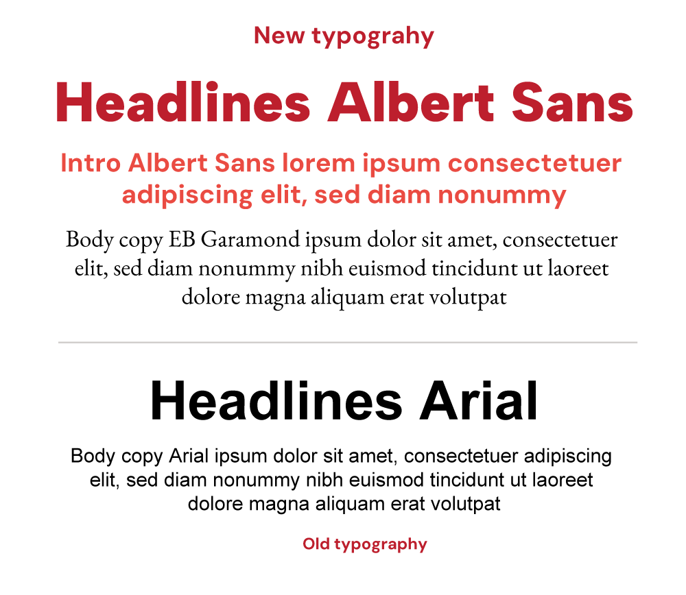
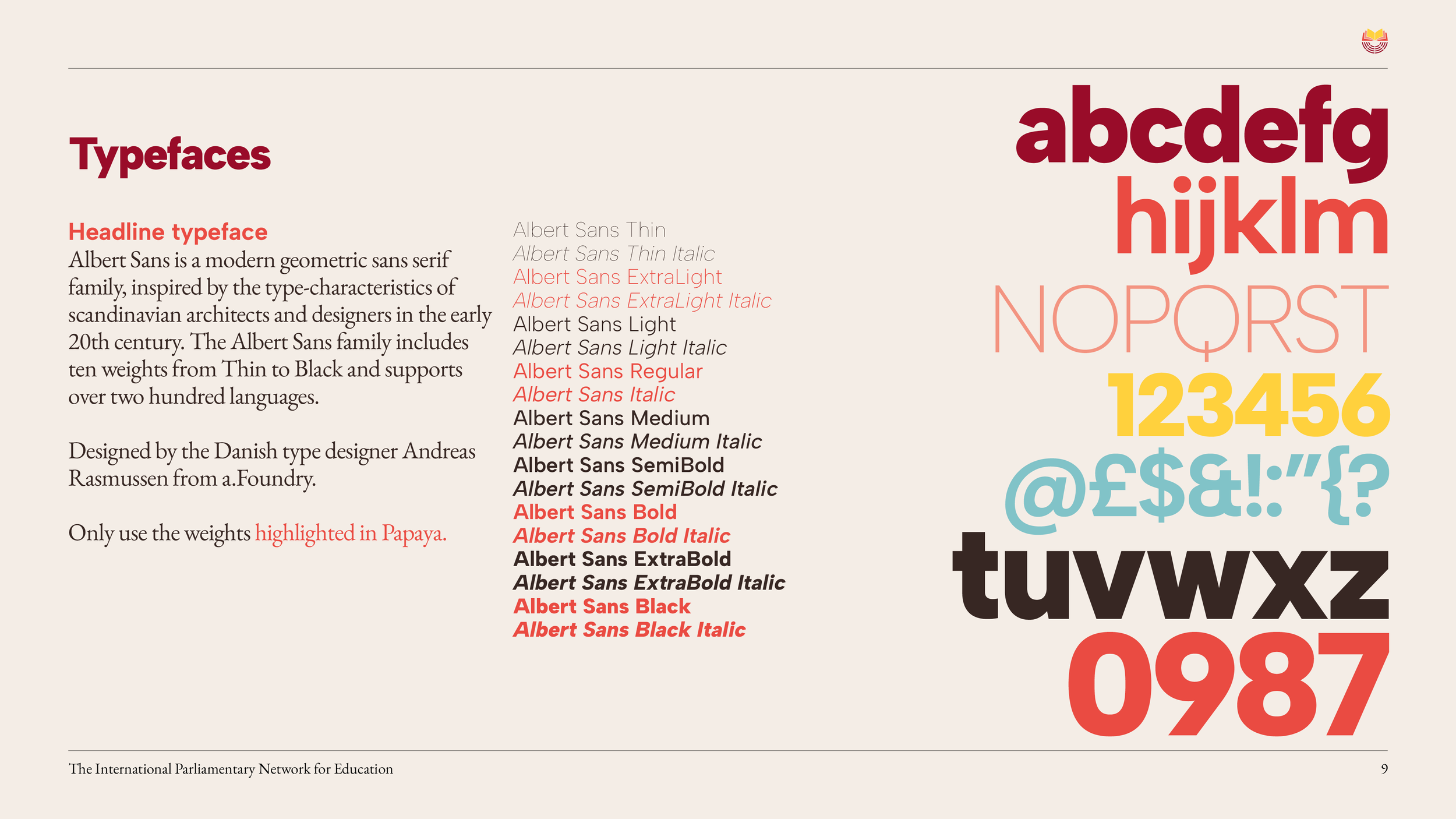
The pairing of Albert Sans with Garamond creates a conversational authority, combining geometric clarity for contemporary accessibility with classical gravitas for policy documents.
Typography

The solution
Three strategic interventions transformed IPNEd's visual impact. First, we shifted the colour palette away from anger to six harmonious tones – stone, sunshine, salmon, papaya, maroon, and earth – creating warmth and political neutrality whilst drawing from educational environments globally.
Second, we paired Albert Sans headlines with EB Garamond body copy. This creates approachable authority – geometric sans serif for contemporary professionalism, classical serif for the gravitas essential in policy documents.
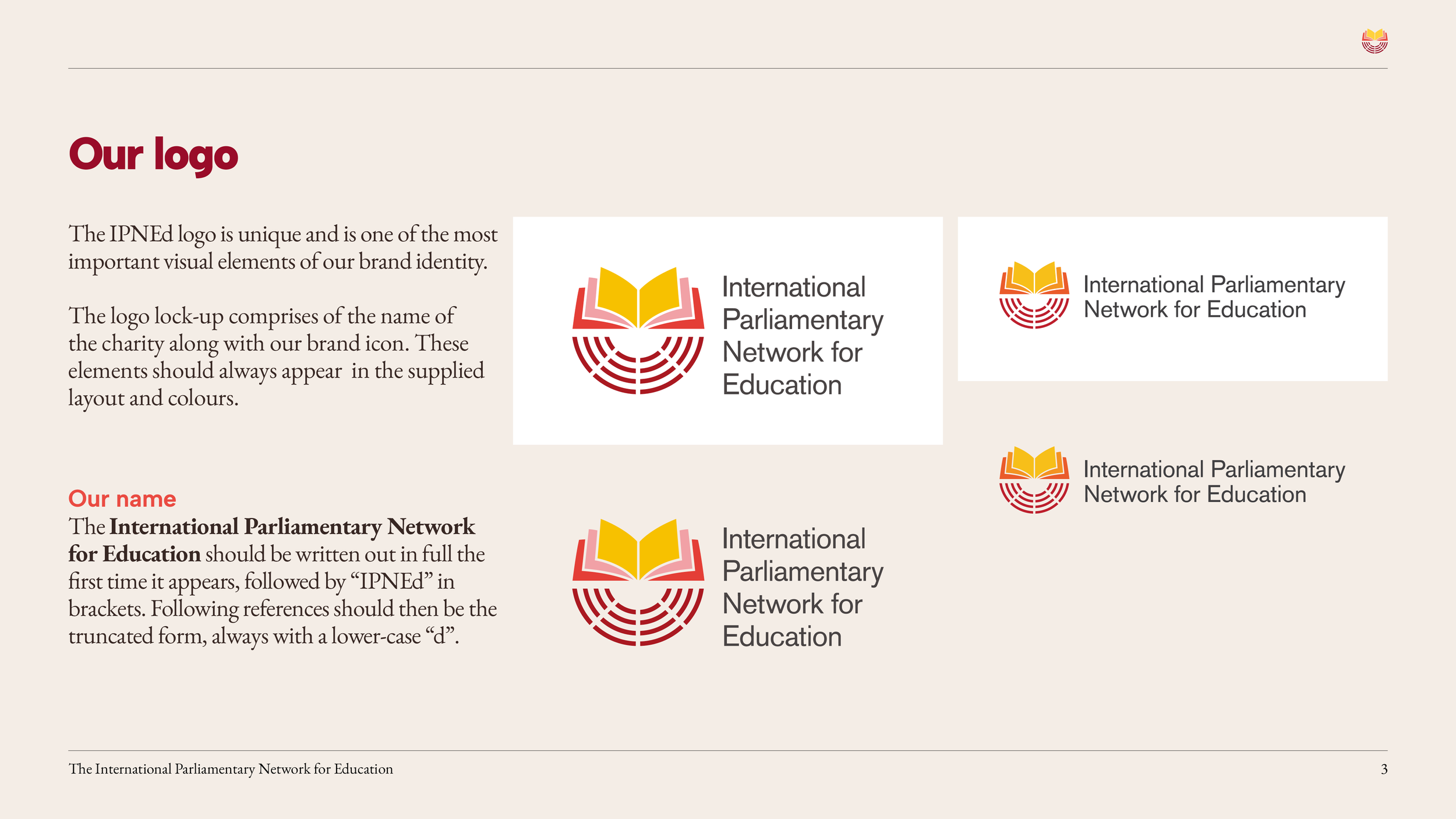
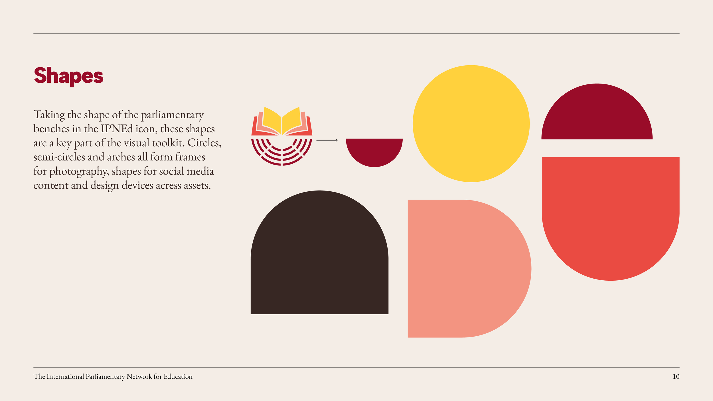
Most distinctively, we introduced circular and arch shapes derived from parliamentary benches within the logo. These 'ownable' geometric forms create instant recognition across applications, establishing IPNEd's unique visual territory in the parliamentary network landscape.
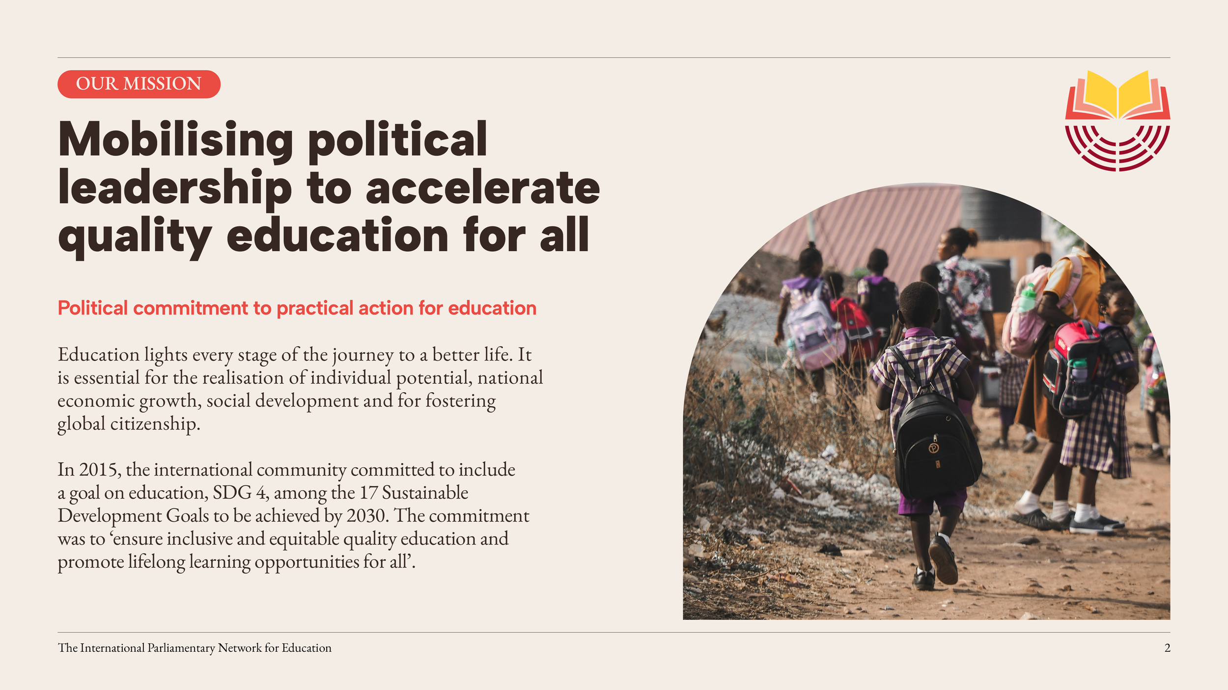
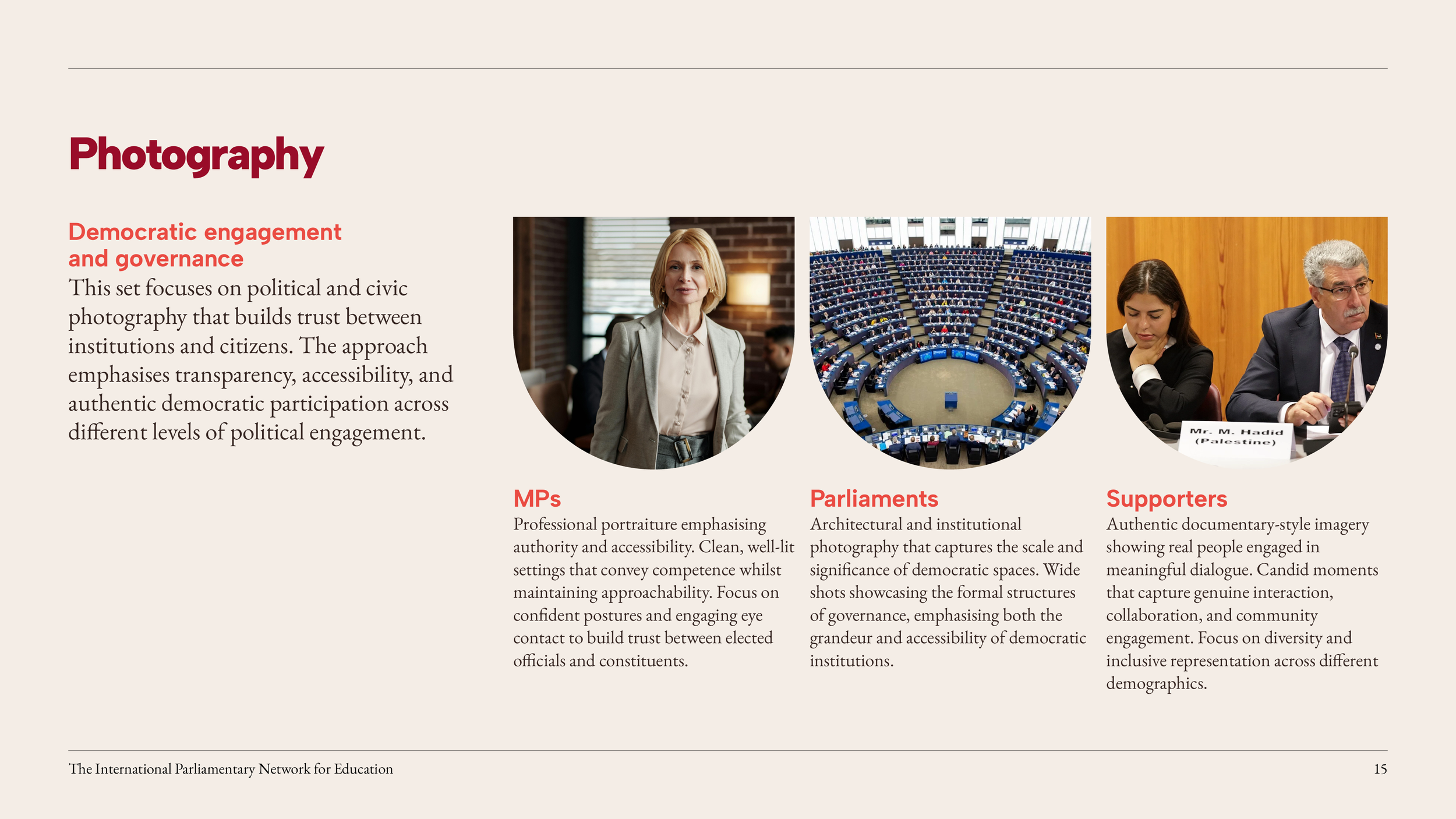
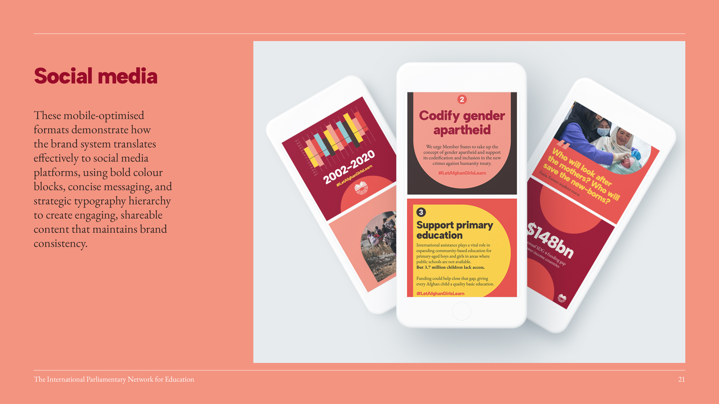
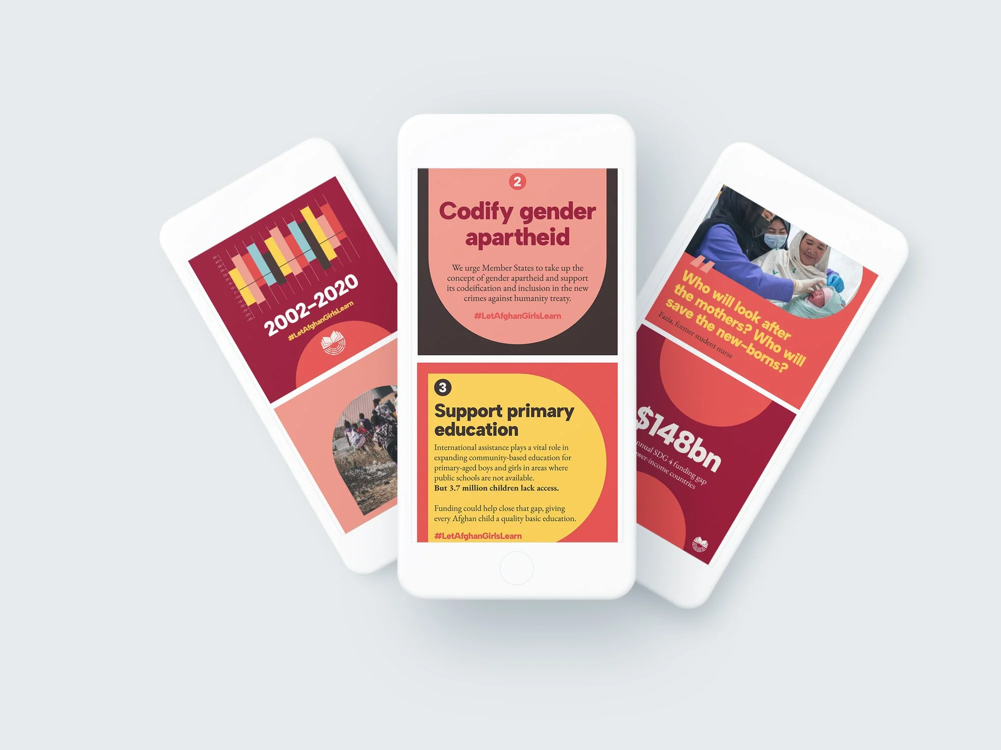
Alongside this, we developed professional photography guidelines that capture parliamentarians with dignity and authority – moving beyond generic political portraits to create authentic storytelling that maintains subject respect whilst highlighting democratic engagement.

The outcome
The refreshed identity elevated IPNEd's professional presence whilst solving practical challenges. The improved colour system provides flexibility for a range of content across channels, whilst signature arch shapes create memorable brand moments. Crucially, we developed Canva templates that democratise good design – empowering staff to create on-brand materials without design expertise, solving the consistency crisis that plagued previous iterations.
The typographic system enhances readability and authority – crucial when communicating complex educational policy to time-poor parliamentarians. The visual language works seamlessly across digital and print applications.
Most importantly, the rebrand positions IPNEd distinctively within the parliamentary ecosystem. Those circular and arch forms hint at parliamentary seats in the logo, while giving the team ‘ownable’ brand devices.
The result is authoritative yet approachable – perfectly calibrated for IPNEd's unique position at the intersection of education and politics.