PORTFOLIO: LEARNERS FROM BIRTH | BRAND, TONE OF VOICE AND WEBSITE
Building a trusted brand for a coalition of early years guides
Kindred² needed to unite a growing library of early years guides – Starting Reception, The Potty Training Guide, The Children's Toothbrushing Guide, and more – under a single, recognisable brand. Then give that brand a website built to earn the trust of the professionals and parents who'd be recommending it.
“The finished product feels thoughtful, considered and genuinely tailored to our organisation.”
– Aaron O'Dowling-Keane, Head of Marketing at Kindred²
The challenge
Learners from Birth has two audiences: early years professionals and parents. The local authority worker weighing up which resource to share across their borough, the nursery manager deciding what to trust, the school leader trying to prepare carers before term starts. And parents themselves, from a diverse range of backgrounds, across the UK.
Win the professionals over, and they carry the guides to the families who need them. Get the brand wrong for that audience, and no amount of parent-facing warmth makes up for it.
Sector comparators like ‘Best Start in Life’ and ‘CBeebies Parenting’ had each committed to one register only: government-issue and corporate, or bright and childlike. Neither reads as an authority that a stretched local authority worker and a tired parent would both trust. Learners from Birth needed to be expert enough for that endorsement, while staying warm enough for the parents at the other end of it.
The process
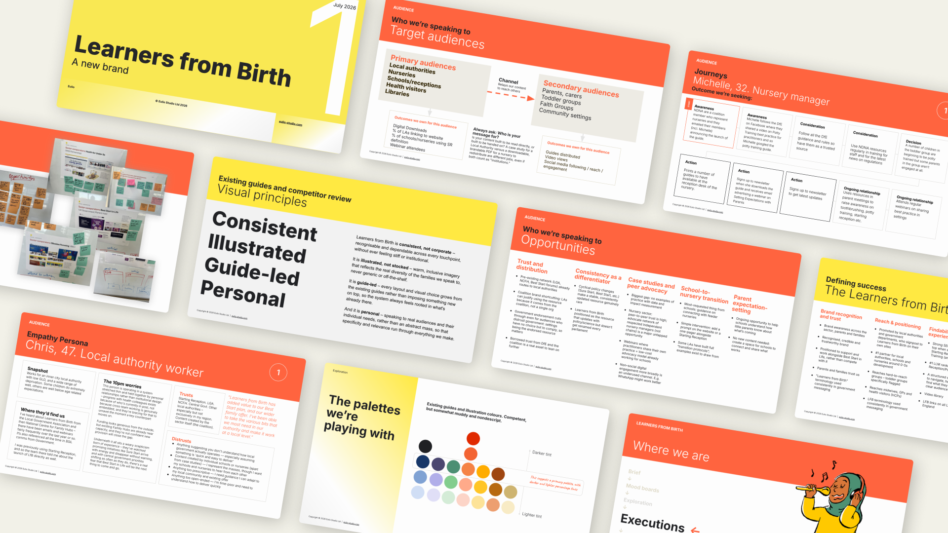
We opened with a workshop, not a mood board deck. Kindred²'s team came in with strong instincts about the brand but hadn't yet agreed on a shared language for talking about it. Before any visuals, we worked through personas, values, tone and audience together. It gave us a steer on visual direction, and it brought the whole team along on how and why the design decisions ahead would be made, so every round of feedback that followed was sharper and faster.
The personas fed into user journeys, which helped us work out where the two audiences' needs diverged, and where they needed the same thing.
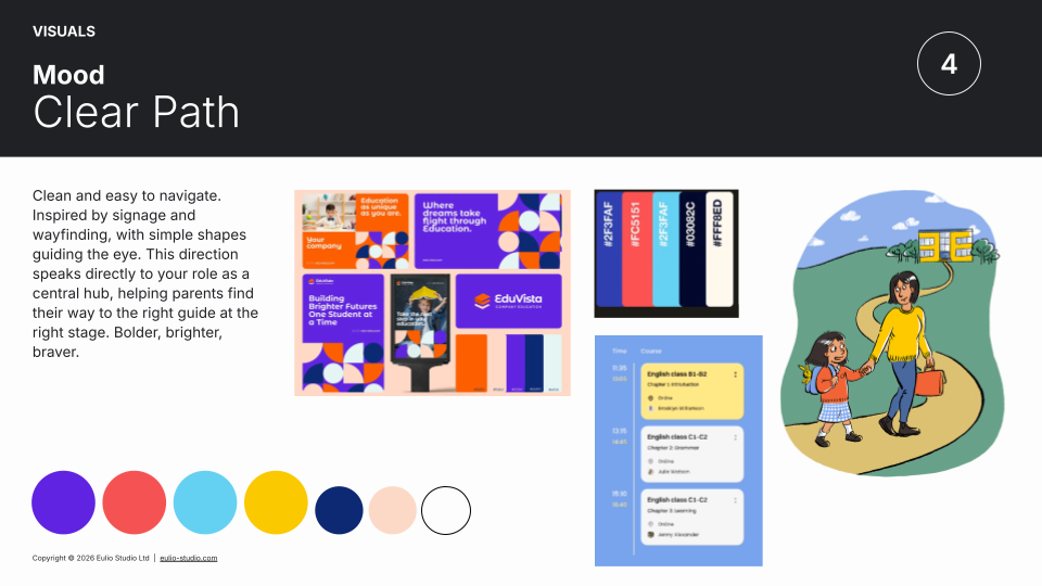
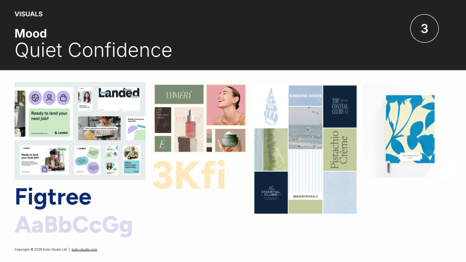
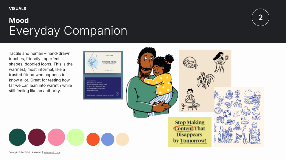
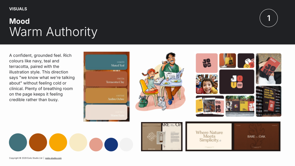
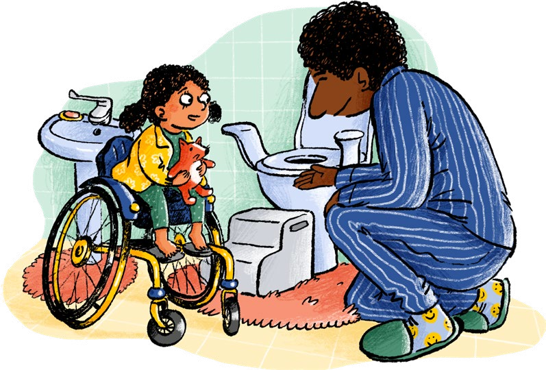
From four mood boards that each incorporated the existing illustration style, we chose a clear, mature direction – a trusted colleague rather than a faceless institution.
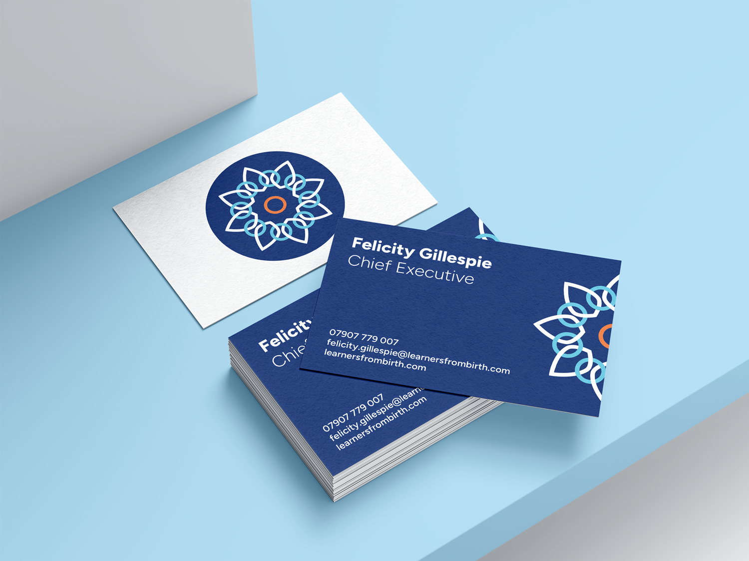
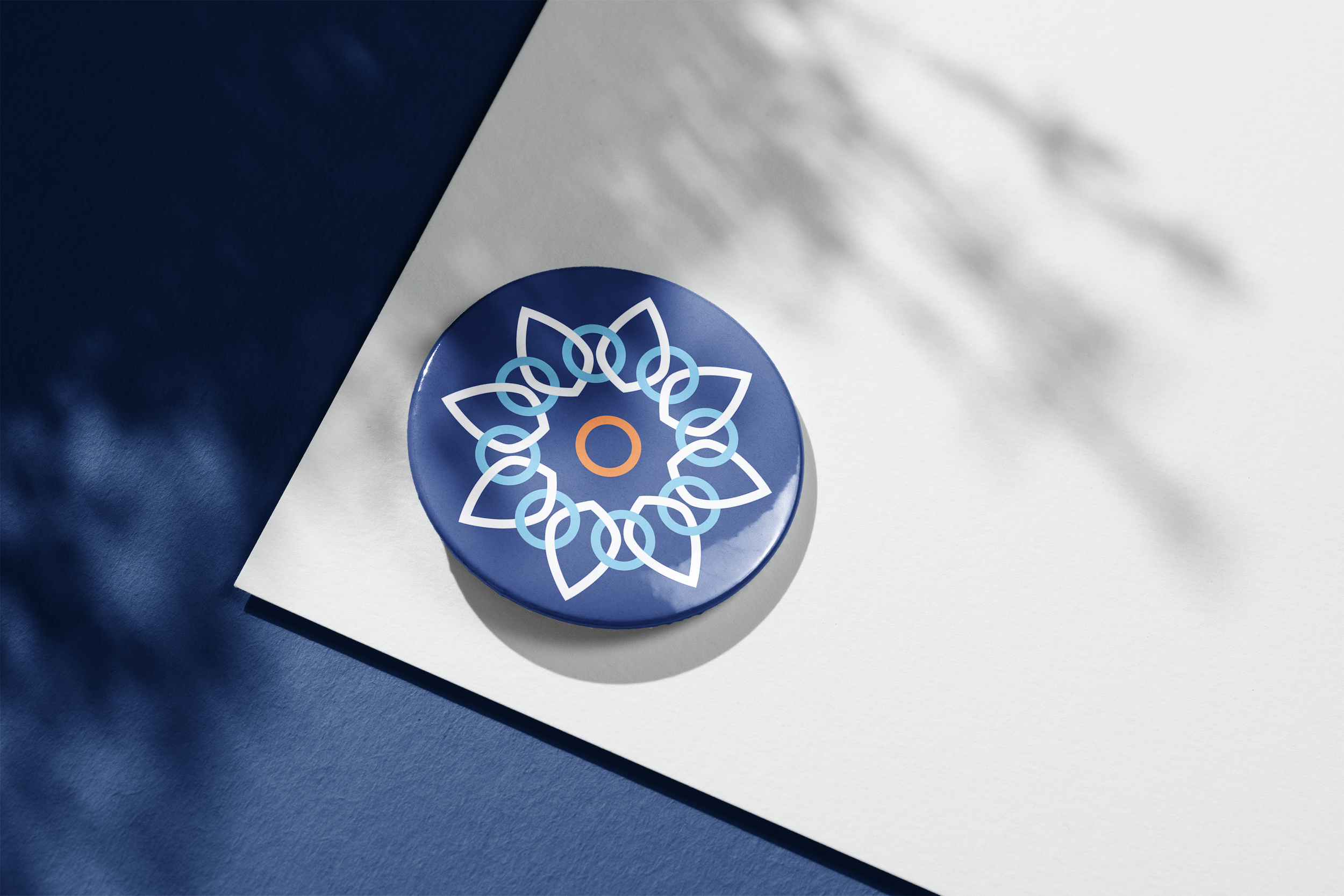
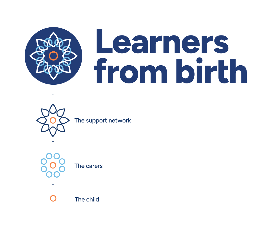
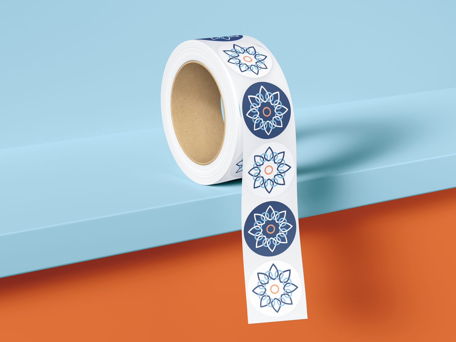
Nine early logo concepts narrowed to three refined routes, and one pulled ahead: a flower built from every child. Circles around them for parents and carers, petals reaching further out for the wider coalition of practitioners, health visitors, educators and services, all supporting the same growth. One mark, telling the whole story.
Colour
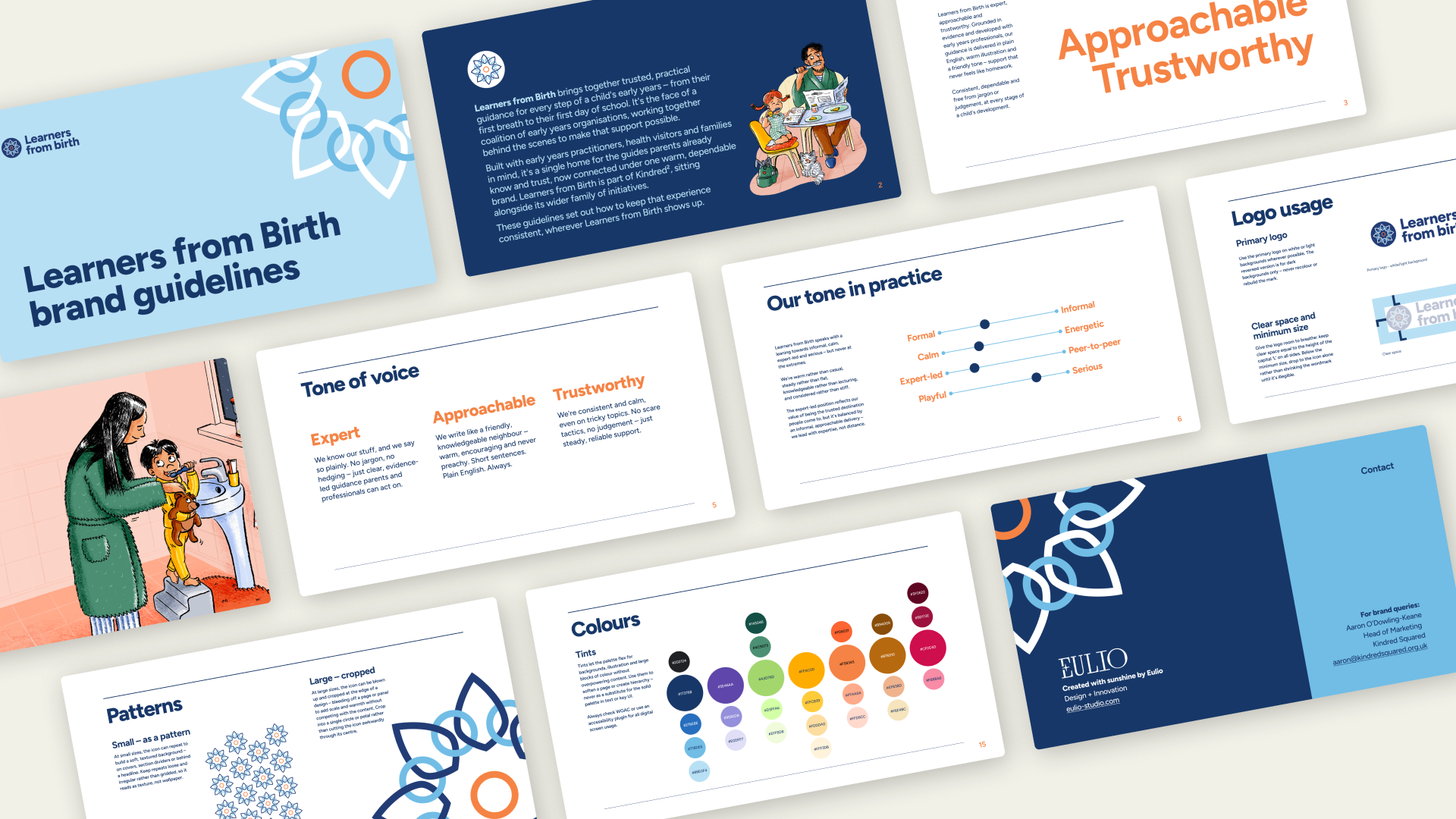
We extended the existing guide colours into a fuller system: seven core hues with carefully controlled tints, built on a hue, saturation, lightness (HSL) model so every shade felt like part of the same family.
Type
Figtree runs across headlines and body copy. It's friendly and legible enough to carry plain-English guidance, and it visibly ties Learners from Birth back to the wider Kindred² family.
Tone of voice
Expert, approachable, trustworthy. We wrote "do/don't" pairings into the guidelines, giving anyone drafting copy a fast, concrete test for jargon before it ships.
The website
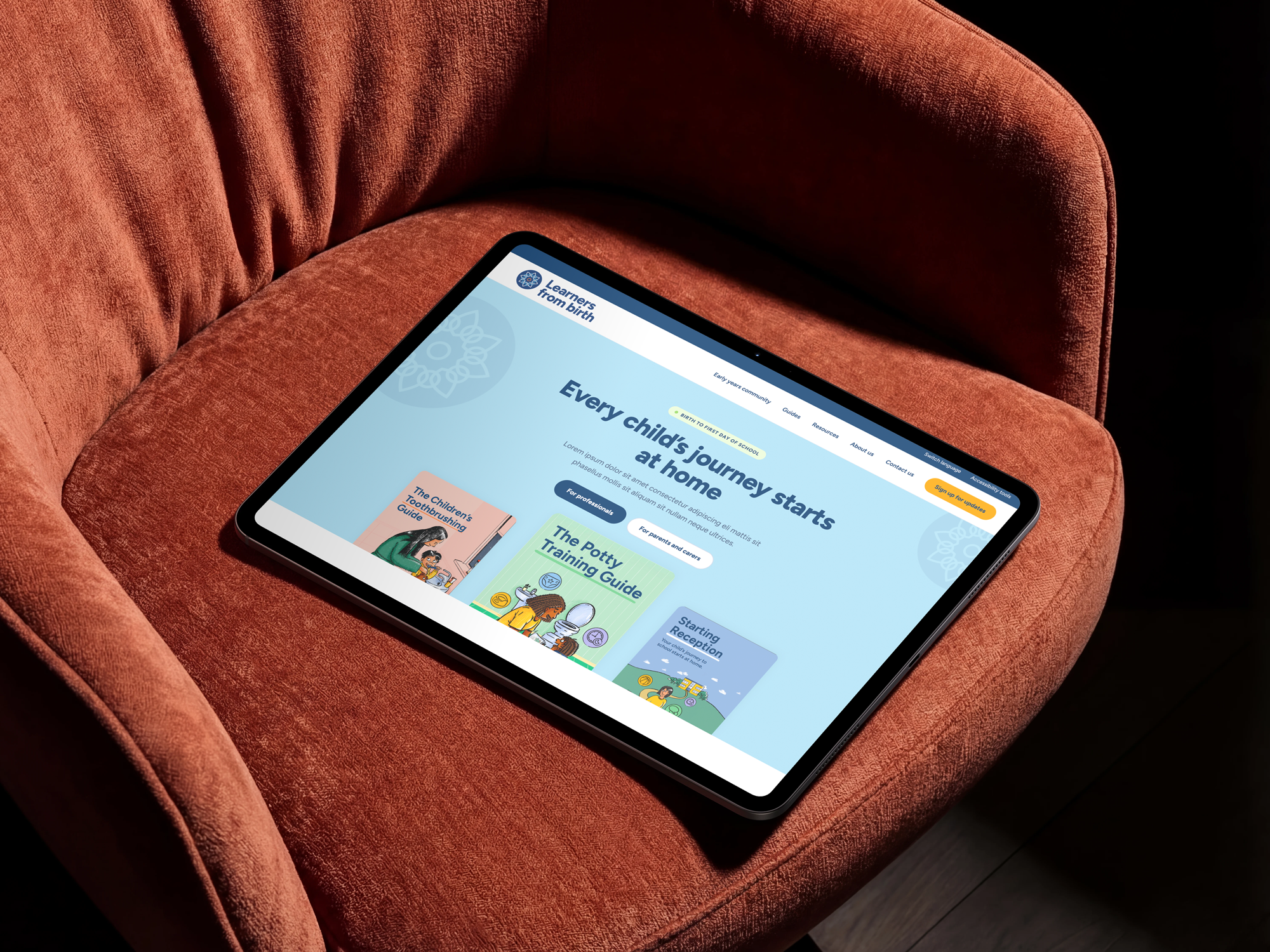
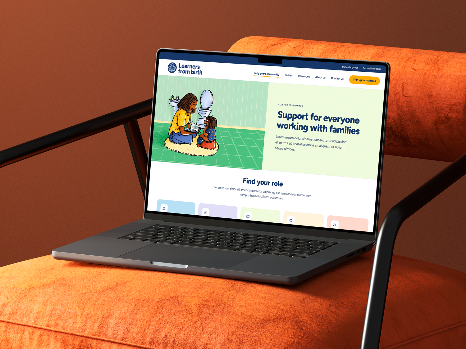
Through three rounds of structural iteration, feedback and workshopping, we sharpened the UX into a professionals-first homepage: a single hub with routing for parents also. We carried over the multi-language and accessibility tools from the existing site, so users with specialist needs lost nothing in the move.
We wireframed and designed the site in Figma Make and Claude Design – Eulio's first time using these on live client work. Against a tight budget and timeline, it kept pace with three rounds of iteration and still delivered a visual result that didn't feel like a shortcut had been taken.
The outcome
Learners from Birth now reads as one brand behind a growing library of guides. It's credible enough for a local authority worker to stake their reputation on, and the guides underneath it still feel like the ones families already know.
The flower mark carries the coalition and the growth story without a word of explanation. The site architecture gets professionals to what they need to endorse the resource quickly, while still routing parents straight to the guide that matters to them in a moment of need. The brand guidelines are lightweight enough for non-designers on the Kindred² team to pick up and run with as the guide library keeps growing.
And it gives Kindred² a brand built to last well beyond this first guide library – one designed to become the resource local authorities signpost by default, rather than one they discover by accident.

“It was a pleasure to work with Eulio. They took the time to really understand our organisation, our existing work and the wide range of contexts in which our resources need to work.
They built thoughtfully on our existing visual identity, elevating what we already had while ensuring our existing assets still felt consistent and relevant.
At the same time, they created a strong, flexible look and feel that can adapt across different formats and gives us a clear foundation for developing future guides. The finished product feels thoughtful, considered and genuinely tailored to our organisation.”
– Aaron O'Dowling-Keane, Head of Marketing at Kindred Squared